

Cereal box designs have shifted over the years, reflecting changes in consumer behavior and branding strategies. Today, the debate often centers around two popular styles: minimalist and maximalist. Each style speaks differently to audiences, and both have their own strengths and weaknesses when it comes to shelf appeal and consumer connection.
The Rise of Minimalist Design in Modern Packaging
Minimalist design has gained popularity across many industries, including food packaging. This style focuses on simplicity, often using limited colors, clean lines, and basic shapes. The goal is to create a sense of calm and clarity for the consumer.
One key reason for the rise of minimalism is the influence of digital culture. With so much visual noise online, people now seek simplicity in what they buy. A clean, uncluttered package feels like a breath of fresh air on a crowded grocery shelf. Minimalist cereal boxes often use white space strategically to draw attention to the product name and important details. This style creates a more premium and trustworthy appearance.
Additionally, minimalist packaging can appeal to health-conscious buyers. When a cereal box uses earthy tones and simple typography, it may suggest that the contents are natural, organic, and healthy. This subtle messaging plays a strong role in buying decisions, especially among younger shoppers who care about what they eat.
From a branding perspective, minimalism allows companies to focus on key values. A brand can highlight its sustainability, natural ingredients, or ethical practices without overwhelming the buyer. This style also translates well across cultures, making it a strong choice for global brands.
However, minimalism may not always stand out among more colorful and bold designs. If every brand adopts this look, it becomes harder to differentiate. This is where the strengths of maximalist design come into play.
The Bold Impact of Maximalist Packaging Styles
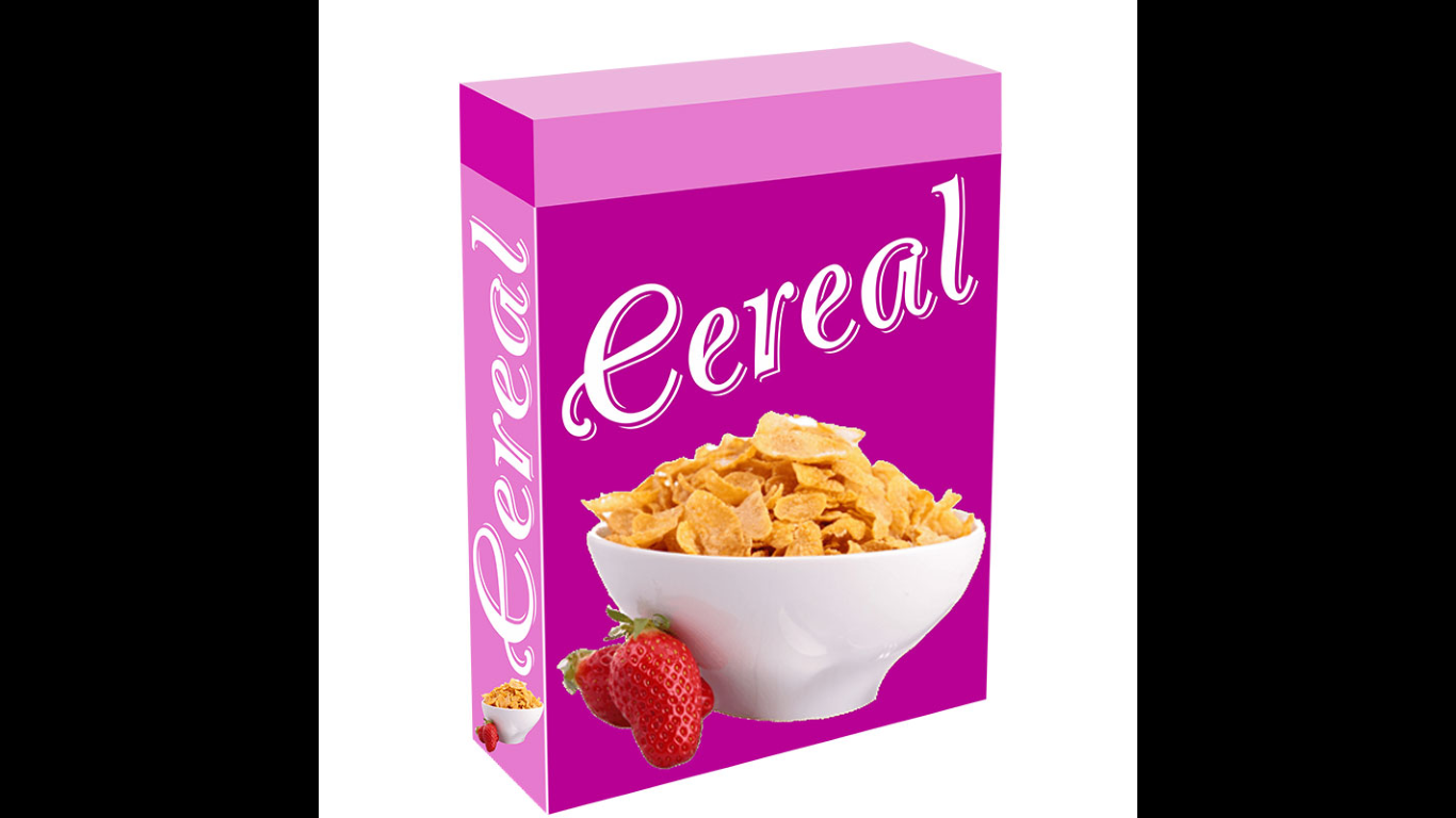
Maximalist packaging is all about attracting attention through rich visuals, bold colors, and complex patterns. Unlike minimalist designs, this approach aims to grab the shopper’s eye immediately. It often includes playful elements, mascots, and large typography.
This style is especially common in products aimed at children. Bright colors and cartoon characters create excitement and fun. A cereal box covered in stars, swirls, and smiling animals will likely appeal more to a child than a plain white box. The design promises not just food, but an experience.
Maximalism is also effective in building a strong brand identity. Brands that use detailed artwork and rich storytelling can connect emotionally with their audience. This helps in building long-term loyalty. For example, a cereal box that tells a story or includes a game on the back adds extra value beyond the food itself.
One of the benefits of maximalist design is that it allows for more creativity. Designers have the freedom to play with color, texture, and layout. This can result in eye-catching packaging that stands out from the competition. It can also reflect cultural trends, seasonal themes, or limited-edition releases.
However, this style can sometimes appear overwhelming or outdated if not executed carefully. Too many elements may confuse the buyer or make the product seem less premium. Balance is key to ensuring that the message still comes through clearly.
Target Audiences and Their Packaging Preferences
Understanding the target audience is vital when choosing between minimalist and maximalist packaging. Different consumer groups respond differently based on age, lifestyle, and values.
Minimalist packaging tends to appeal to adults, particularly millennials and Gen Z. These groups often look for health benefits, clean ingredients, and sustainability. They prefer products that look modern, organized, and simple. A cereal box with neutral tones and minimal text might feel more honest and reliable to them.
On the other hand, maximalist designs are more effective with children and families. Bright visuals, characters, and games on the box make the cereal seem more exciting. Parents buying for kids might choose the more colorful option simply because it captures their child’s interest.
Cultural factors also matter. In some countries, bold packaging is the norm. People expect vibrant colors and busy designs as signs of a good product. In other regions, clean and subtle packaging might be seen as more premium or healthier.
The key is aligning the packaging style with the audience’s expectations and values. Brands that understand their buyers can craft more effective messages through design. It’s not about which style is better, but which one communicates more clearly to the intended customer.
Visual Hierarchy and Information Placement
Design is not just about looks—it’s also about how information is presented. A well-structured layout guides the consumer’s eye, helping them find what they need quickly.
Minimalist packaging usually follows a strong visual hierarchy. The brand name or logo takes center stage, followed by the product name and essential details like ingredients or certifications. The use of space and alignment makes it easy to scan the box.
Maximalist packaging often places more elements on the box, which can make the layout more complex. Still, when done right, it can also create a strong flow of information. For example, a cereal box might lead the eye from a bold headline to a mascot, then to a story or promotion on the back.
Each style can succeed if the visual path is clear. Poor layout—too much clutter or poor spacing—can hurt both designs. Consumers don’t want to work hard to understand what they’re buying. They want clarity, even if the design is full of details.
The challenge for maximalist designs is to maintain order among chaos. Using contrast, color blocking, and typographic hierarchy can help keep the design readable. Meanwhile, minimalist designs should avoid being too empty or cold. Small touches of color or texture can make them more inviting.
Emotional Connections Through Design Choices
Design has the power to build emotional connections. People often choose products not just for function, but for how they make them feel. Packaging plays a key role in this emotional response.
Minimalist packaging often evokes calm, trust, and purity. These emotions are linked to modern lifestyles where people seek balance and mindfulness. A simple cereal box might suggest a slow, healthy morning routine. This creates a positive experience even before the product is tasted.
Maximalist packaging brings feelings of joy, excitement, and fun. It appeals to nostalgia, especially when designs feature classic mascots or retro themes. Parents who grew up with certain cereal brands might feel connected through the bright designs of their childhood.
This emotional connection can build long-term brand loyalty. When customers feel good about a product, they’re more likely to return. Whether the box is simple or bold, the goal is to connect on a personal level.
Designers often use colors, typography, and illustrations to shape these emotional reactions. Each element should support the brand’s voice and message. Consistency across product lines also helps build trust over time.
Branding and Differentiation in Competitive Markets
In a crowded market, packaging must do more than inform. It must set the brand apart. Design style plays a major role in how quickly and clearly a product is recognized.
Minimalist designs create differentiation through restraint. When every other box is shouting for attention, a quiet design can stand out. It communicates confidence and clarity. Brands that use this approach often position themselves as premium or health-focused.
Maximalist packaging sets itself apart through storytelling and visual richness. It offers more to explore, which can create a deeper connection. These boxes can reflect cultural relevance, humor, or even education, making them memorable.
Each approach can be a strong branding tool if used well. The key is consistency. A cereal brand should stick with a design language across all products so buyers can recognize it quickly. Switching styles too often can confuse consumers and weaken brand identity.
Design also supports product line extensions. Minimalist brands might differentiate flavors through small color changes. Maximalist brands may use unique mascots or artwork for each flavor while keeping core elements consistent.
Sustainability and Packaging Design
Sustainability has become a major concern for both consumers and brands. Packaging design now plays a role in signaling environmental values.
Minimalist designs often align better with eco-friendly messages. They use less ink, fewer materials, and often feature recyclable packaging. These choices match the values of buyers who care about the planet. Simple designs may also appear more authentic and less wasteful.
Maximalist designs face more challenges in this area. Using many colors, glossy finishes, or complex coatings can reduce recyclability. However, brands are finding creative ways to make even bold designs eco-conscious. For example, using soy-based inks or biodegradable coatings can help reduce the environmental impact.
Sustainability should be considered in the design phase. It's not just about the materials used, but also the message the box sends. A product that looks wasteful may turn away eco-aware consumers, even if the cereal inside is healthy.
Key Features That Attract Buyer Attention
Some design elements play a direct role in attracting consumer attention. Whether minimalist or maximalist, successful packaging shares these features:
- Clear product name and branding
- Readable fonts and strong color contrast
- Relevant imagery or icons
- Callouts for health claims, flavor, or ingredients
- Unique shape or box texture
Maximalist packaging often uses large icons, mascots, or games to hold the buyer’s attention longer. In contrast, minimalist packaging might use matte finishes, embossing, or foil stamping to feel more premium.
Ultimately, the right combination of visual and tactile elements creates a powerful impression. Even a small touch, like a soft-touch coating or a debossed logo, can set a product apart.
Conclusion
Both minimalist and maximalist packaging designs serve important roles in the modern market. The choice depends on the product’s target audience, brand message, and market position. Each style has its own way of building trust, standing out, and telling a story. By understanding what consumers respond to, brands can create packaging that not only protects but also connects. Whether the box is simple or bold, thoughtful design makes all the difference. And in that space, even a single well-crafted cereal packaging can shape buying decisions.
Order Now with Cheap Prices: https://ibexpackaging.com/cereal-boxes/